


Best Local COVID-19 Websites To Keep Track Of The Situation
The World Health Organisation has officially declared the COVID-19 outbreak a pandemic and it's more pertinent than ever that the information we're getting about the situation is up-to-date and reliable.
But with so much breaking news on the number of local cases constantly streaming though our feeds, how do keep track of it all? Here are 3 micro sites that we recommend putting on your dashboard for all your COVID-19 facts and figures.
The Straightforward No-Nonsense One
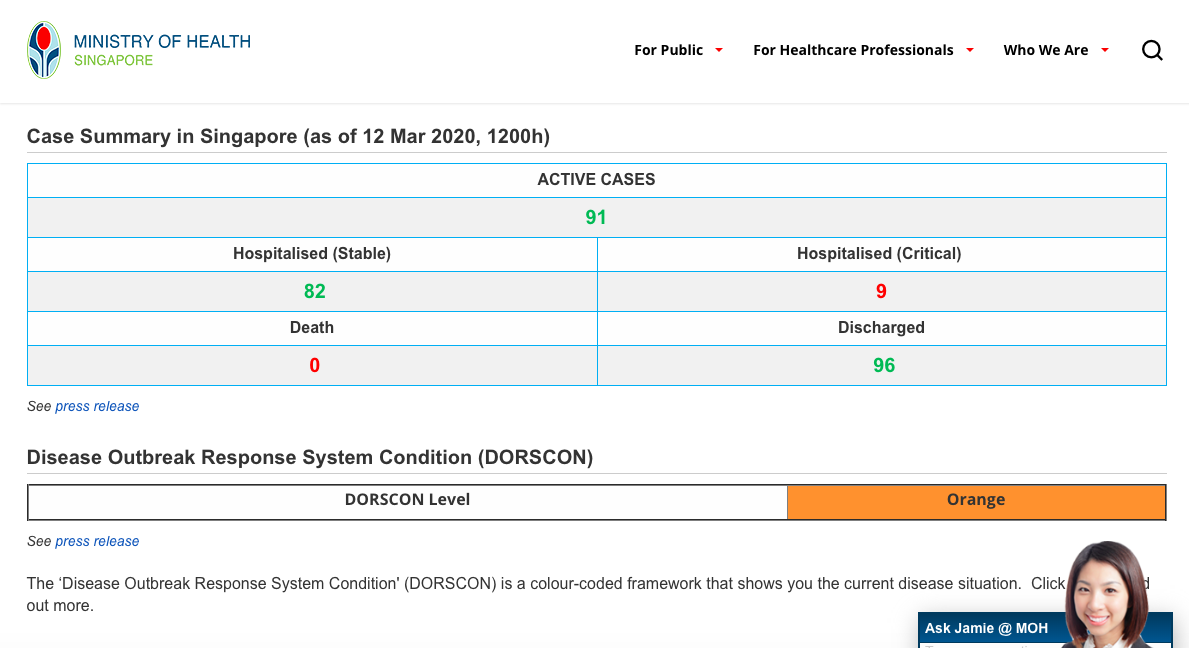
What it does: The government's official repository and central hub for the latest COVID-19 updates, including a case summary table and current DORSCON level.
Who’s behind it: The Ministry Of Health.
Why we like it: It’s no nonsense and looks like a secondary school textbook, if we're being honest. But it is as official as official gets. So if you're looking to sieve through the misinformation out there (i.e paranoid aunties forwarding fake articles on WhatsApp), this should be your go-to site.
The Impressive Motion Graphics One
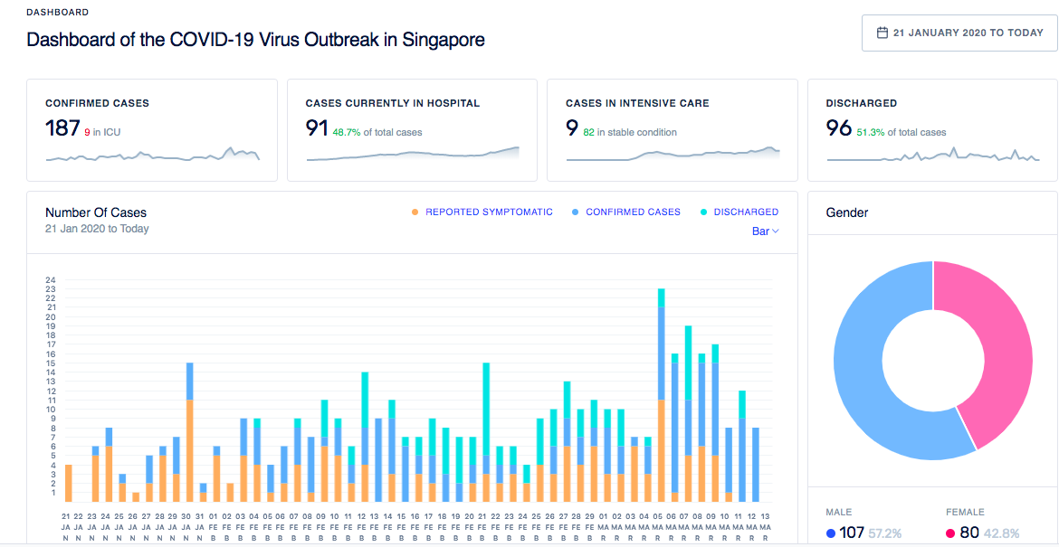
What it does: An in-depth and comprehensive layout of all the available data regarding COVID-19 supplemented by graphs and pie charts which serves as a visual guide.
Who’s behind it: UpCode Academy, a local coding school.
Why we like it: Talk about a big flex. These coders are putting their skills to good use and presenting data in a way that is succint and easily digestible. From stats on the patients’ gender, age and nationality to whether it’s a locally transmitted or imported case, it's easily the most comprehensive site out there.
There’s even an interactive visual network that shows the connections between cases and a playable map to see how they are distributed. We are all for animated infographics, and the depth of information here is the bomb!
The Cheem One That Makes You Feel Smart
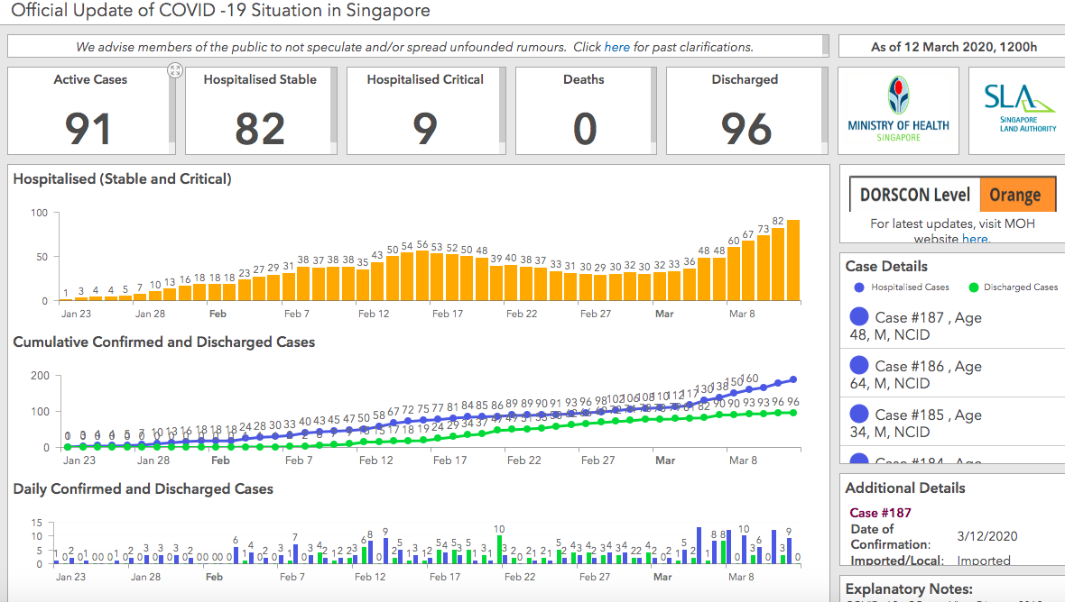
What it does: Through real-time monitoring and analysis, they are able to map out the constantly evolving situation through live graphs.
Who’s behind it: Esri Singapore. They are the nation's foremost authority on Geographic Information System (GIS) technology. The company uses smart mapping technology to analyse data (cheem, we know).
Why we like it: The information is concise and straight to the point. The fonts are big and clear while the numbers are updated in real time. The graphs are also a clear representation of the community spread in Singapore so far. Just follow the big yellow bars and you'll be good.
For the latest updates on Wonderwall.sg, be sure to follow us on Facebook and Instagram. If you have a story idea for us, email us at [email protected].


